NEKULAB
© Selected Works
Year 2026
LOGO DESIGN
MODERN
CREATIVE STUDIO
Brand Name:
Nekulab
Date:
2022
5 Minutes
Industry:
Creative
7-10 Days

Overview
(01)
A Logo Built Around Curiosity, Movement, and Hidden Meaning.
The Nekulab logo explores how a simple geometric system can carry multiple meanings. Built from four polygonal shapes, the mark began as an isometric interpretation of the letter 'N' a direct representation of Nekulab itself.
From there, the form was refined, combined, and transformed into a dynamic symbol that represents movement, adaptability, and creative exploration.
Challenge
(02)
How do you turn a letter into a symbol without making it look like one?
The goal was to create a mark that could represent Nekulab beyond its name. It needed to feel structured yet flexible, while hiding the 'N' within the symbol as a subtle visual discovery.
Concept
(03)
From an isometric 'N' to a multidirectional symbol.
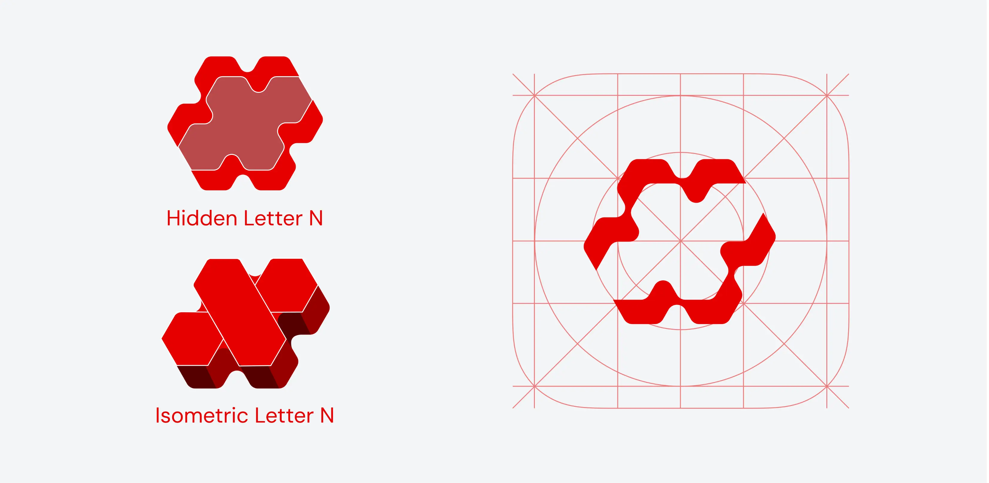
Four polygons were first arranged to construct an isometric 'N'. The form was then softened, duplicated, and combined to create the central negative space.
By separating the final shapes in opposite directions, the mark gains a sense of movement like arrows reaching outward. This represents Nekulab’s ability to approach design from different perspectives, adapt to different needs, and reach toward a wider creative world.
Hidden within the center is the 'N' a quiet signature waiting to be discovered. The balanced geometry also allows the mark to retain its form when rotated 180°, giving it an ambigram-like quality.
Outcome
(04)
Simple at first glance. More meaningful the closer you look.
The final symbol combines geometric structure, hidden identity, movement, and rotational balance into one compact mark.
Four polygons became an isometric 'N'. The N became negative space. And the negative space became a symbol for how Nekulab approaches design from every angle, always adapting, always exploring.
1
2
...
6
